Case Study 2: Cardlytics
Practice Building & Scaling a Two-Sided FinTech Platform (Advertiser Ads Manager & Venmo Banking Offers)
Impact Highlights
- Time Reduced – Reduced partner ad campaign launch timeline from several weeks to under 1 week.
- Enterprise Adoption – Validated the “Activatable Offers” UX model for Venmo, directly informing B2B expansion and platform integration.
- Practice Scaled – Pioneered the UXR program as the first research hire, expanding the team from 1 to 4 researchers and establishing core Research Ops.
1. The Challenge & Business Context
Cardlytics (CDLX) powers cash-back rewards programs for major financial institutions (including Bank of America, Chase, Wells Fargo, and Venmo), sitting at the center of a two-sided FinTech ecosystem. Advertisers fund targeted campaigns on the B2B side, while banking consumers discover and redeem offers within their native banking apps on the B2C side.
As Cardlytics’ first Lead UX Researcher, I was tasked with solving two critical operational and strategic bottlenecks across both sides of the platform:
- B2B Advertiser Bottleneck – Legacy campaign setups relied on manual client service pipelines that took several weeks per setup, limiting platform adoption for newer advertising partners.
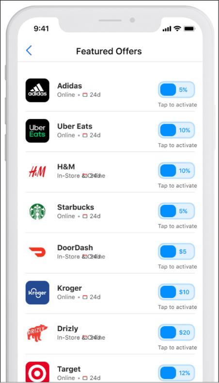
- B2C Banking Partner Constraint – To secure and expand enterprise partnerships with neobanks like Venmo, Cardlytics needed to validate new “Activatable Offer” mobile interfaces to ensure banking customers found rewards intuitive and engaging.
2. Research Strategy & Execution
To drive research maturity across the organization, I designed a multi-stream research strategy targeting both advertiser workflows and consumer redemption behaviors:
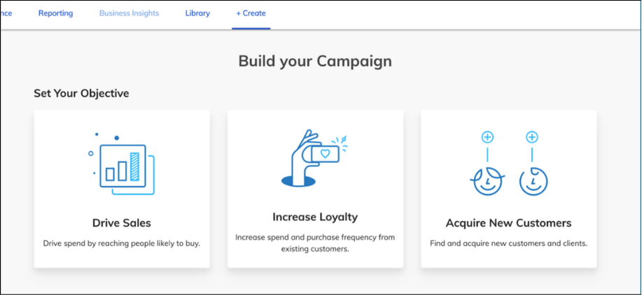
Stream A: Enterprise Ads Manager (B2B Supply Side)
- Generative Longitudinal Diary Study (N=25) – Led a 2-week diary study with traditional and Neobank customers to observe real-world campaign management habits and align cross-functional stakeholders across Sales, Data Science, and Product.
- Moderated Prototype Usability (N=12) – Facilitated 50-minute moderated Zoom sessions with agency media planners testing clickable prototypes under remote mouse control, measuring baseline UX constructs.
Stream B: Venmo Activatable Offers Study (B2C Demand Side)
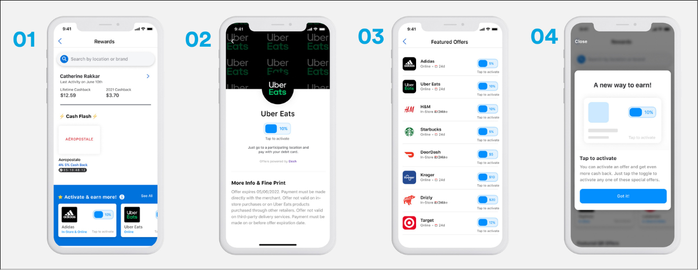
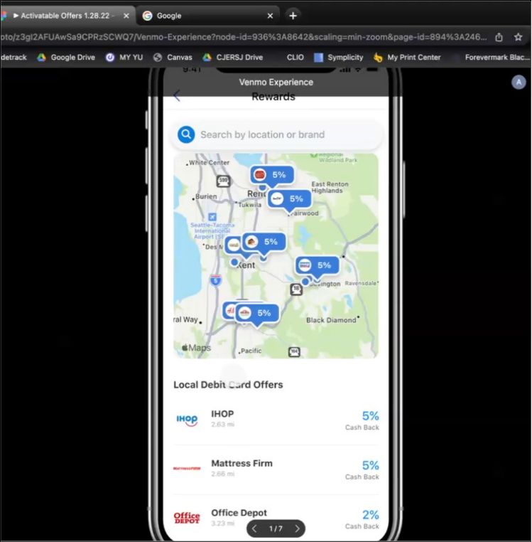
- Unmoderated Usability Benchmarking (N=16) – Partnered with product management and design leads to execute a 2-round unmoderated usability study on UserTesting.com across active and new Venmo debit card users recruited via Respondent.io.
- Hypothesis Validation – Tested user navigation across “activatable” (tap-to-toggle) vs. “non-activatable” (automatic card-linked) offers, evaluating the “Rewards” page Information Architecture, education pings, and category collections.
3. Key Insights
B2B Advertiser Insights
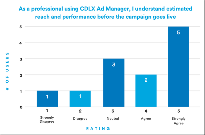
- Media planners overwhelmingly favored a Campaign Ad Group Creative hierarchy, rating the familiar structure at an average of 4.9 / 5.0.
- Advertisers needed clearer audience reach estimation and custom buyer personas before committing ad spend.
B2C Venmo Consumer Insights
- Users struggled to distinguish between offers requiring manual activation versus automatic card-linked rewards, mistaking “Featured Debit Offers” for non-activatable deals.
- Participants felt the main Rewards page was overcrowded, requesting dedicated “Activated Offers” views, bigger expiration timers, and clearer card badges.
- Everyday collections (“Local Eats,” “Groceries”) generated strong positive emotional responses and intuitive browsing behavior.
4. Business & Product Impact
- 1-Week Campaign Onboarding – Replaced cumbersome manual client service tasks with a self-service Ads Manager flow, reducing live campaign setup time from several weeks to under 1 week.
- Secured Venmo Partnership – Delivered empirical research recommendations that restructured Venmo’s Rewards page IA, validating activatable offer interactions and directly supporting B2B expansion.
- Scaled Research – Built Cardlytics’ foundational Research Ops infrastructure (Airtable repository, Qualtrics workflows) and expanded the UXR team from 1 to 4 researchers.